Living Room Renovation, Part One: The Problem
This post may contain affiliate links for your convenience. Read my full disclosure policy here.
Apparently my family is conspiring against me in these photos. No matter what I tried, they kept sneaking into the shot! It’s like “where’s Waldo” over here…
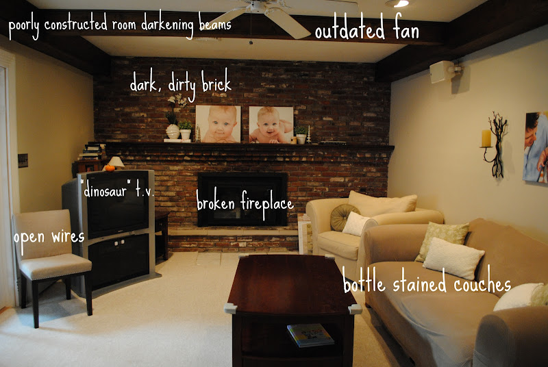
Of all the rooms in our home, the living room makes me cringe the most. We applied to have HGTV makeover that space, but they wouldn’t touch the original brick and beams. They said that’s what they typically add to homes to give them character. When they spotted our sunroom in the application photos, I knew we’d lost our chance– that was the room they chose to make over.
Now we have a beautiful sunroom but a dark and dingy living room.
What makes it so bad? Where do I start?
30 seconds before the above photo was taken, I evicted my husband from the couch.
Back to the issues. How about a doorway or other immovable feature on each wall? Try coming up with a floor plan for that situation! I know you aren’t supposed to put all the furniture against the walls, but when we attempt to “float” it then one or more doorways gets blocked. Plus, the t.v. is huge and the location of the cable outlet makes putting it anywhere else difficult. Oh, and the wires are open and the only thing stopping Noodle from them is a flimsy chair I shoved in the corner.
This furniture arrangement is just terrible.
Here’s an awkward corner, no focal point just furniture.
Oh yes, the ottoman doubles as a diaper changing station. Don’t worry, we’ve got it covered.
Dude, really, just 3 more minutes and I’ll be done with the photos!
The floorplan issue aside, the room gets no natural light because there are no windows to the outside. The only glimpse of the outside is through the french doors.
See the difference in light? Sunroom= lots of light, living room= no natural light.
Add to that a wall made entirely of brick and large, heavy beams on the ceiling and the room is dark with a capital d… okay, that would be Dark.
Plus a fireplace that the seller “forgot” to disclose was broken. What a dud. {And yes, I’m referring to both the seller and the fireplace}.
Oh, and Noodle’s favorite place to play? Why, the hard and sharp brick! Of course, that’s when she’s not playing with her other favorite spots: the glass doors to the t.v. stand and the open wires coming out of the wall.
Just posting this photo gives me anxiety. Ack, no storage space! Hard brick! CLUTTER!
…aaannnndddd open wires. NICE.
There is not a single place to store things in this room.
It also serves as our entryway from the garage, hence the shoe baskets by the doorway.
:: sigh ::
When I was 7 months pregnant I finally decided I would just paint the brick. I called in a pro for an estimate and he refused to paint it. Look, I know there are brick lovers out there but to me it’s just a dusty reminder of the 60’s when the home was built. Of course now I can’t bring myself to paint it since most people tell me not to touch the brick with a paint brush.
I feel as if I’ve done all I can do on my own, and it’s time to call in the professionals.
We’ve cooked up a plan to brighten the room and make it more family friendly. We’ll tackle each problem in stages to best use our time and money. Stay tuned for Part II of our living room plan to see what we have in store for this dark, cluttered, shudder-worthy space.


