How to Style Vignettes in Real Life {Day 23}
This post may contain affiliate links for your convenience. Read my full disclosure policy here.
So, if I sneak in a post before midnight– like this one on how to style vignettes– it still counts as Day 23, right? I’ve been madly freelancing in addition to posting here and my head can’t keep the days straight! Sleep is overrated, right? Like showers. Totally overrated. Anyways, now that you don’t want to stand within 10 feet of me, I have a controversial topic on the blog today: HOW TO STYLE A VIGNETTE.
Dum dum dummmmmmm. {insert evil music here}
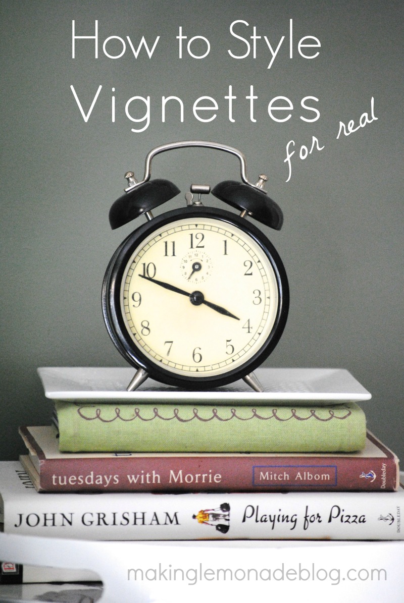
Right now you may be questioning my understanding of the definition of controversial, but bare (bear? it’s 11 PM. I don’t know) with me. Vignettes, or small styled areas in your home, have always seemed a little stuffy to me. I know of someone who had the same vignette in their entryway for 10+ years– a few old books with a pair of antique eyeglasses placed just so on top. It was lovely, but stagnant. It didn’t move. It didn’t reflect the home or the people inside. And if it had been in my house, my kids would have grabbed those eyeglasses and used them to play Mr. Potato Head before carelessly discarding them in the toy bin.
That being said, vignettes can work. In fact, they can be spectacular. I’ve been pinning them like crazy, so if you want to see more be sure to follow me on Pinterest so we can bask in vignette love. BUT– I have strict standards for vignettes. They have to be unique. They must be kid-friendly (in my home, anyways). And they need to be something more than just being a museum for items that don’t have a use in your home. Plus, I’m always looking for that WOW factor, that ‘thing’, that makes my design loving heart say ‘ahhhhhhhh.’
In other words, I need to LOVE it.
I don’t necessarily believe in ‘formulas’ for vignettes, but there are certain rules that work for a reason. Here’s a few ideas for creating a vignette that reflects you and your current season of life:
1. Start with the art.
Grab two framed pieces, one larger than the other, and layer them. Or, hang two symmetrical frames right above the scene. Here, I kinda do both of those things.
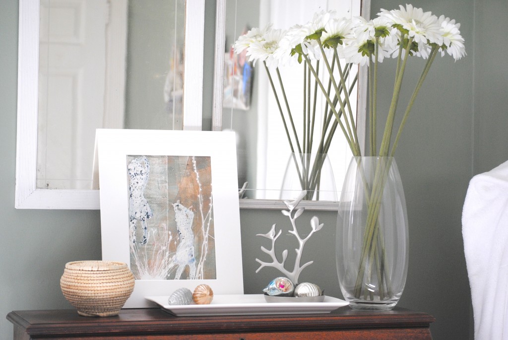
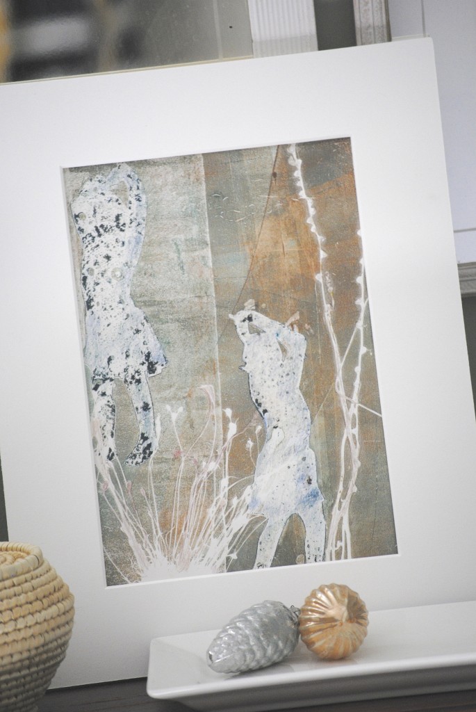
The vintage mirrors came from my husband’s grandmother. You won’t believe where the art came from– my mom made a gelatin print of my daughter using the photo from one of my all time favorite posts– Tiny Dancer. This copy was actually a discard that I snatched up from her studio during a recent visit.
2. Add something horizontal.
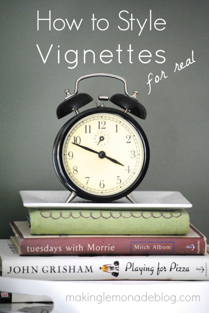
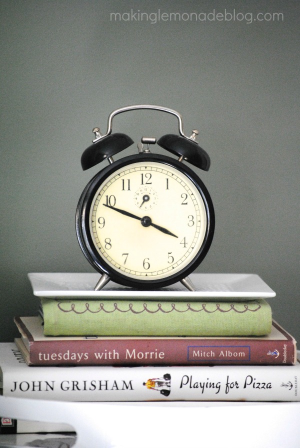
The most common items are books– ones that have meaning or are beautiful– and/or a tray. Here’s a roundup of trays in various styles if you’re looking for one. This white tray at the bottom of the photo is actually covered in butterflies and is damaged with a scratch– making it $3 at HomeGoods. All styled up, you can’t see the butterflies or the damage. The tiny basketweave ceramic tray under the clock was a $4 antique store find.
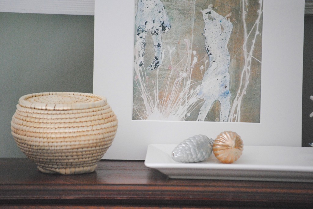
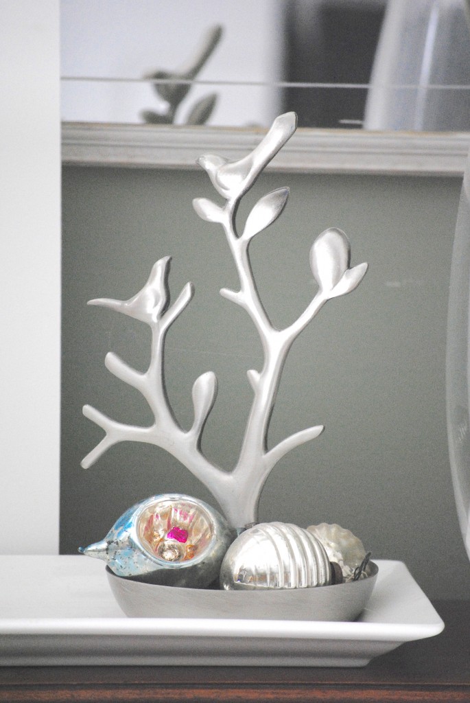
This rectangular tray was another HomeGoods score for a few dollars. It holds a few vintage Christmas bulbs all year-round because I love them no matter the season.
3. Add a showstopper.
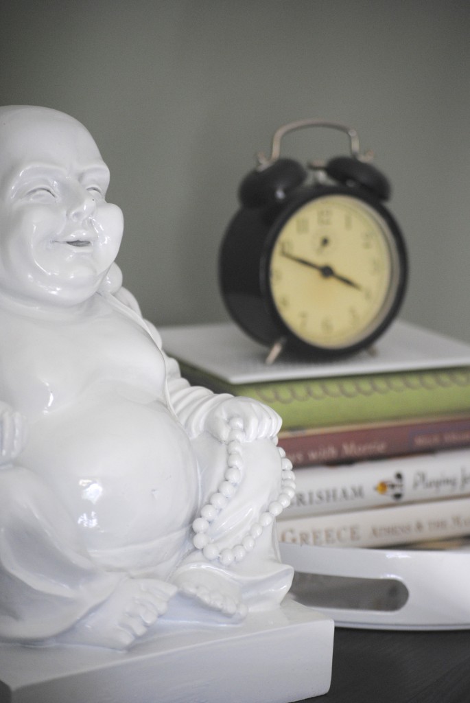
Find something that will draw you in. It doesn’t have to be flashy, it just has to be awesome. Go for various heights, too. I love this thrift store clock. It looks vintage, but later I realized it might be from IKEA, ha! But the showstopper is probably the Buddha. He’s very calming. And also showstopping.
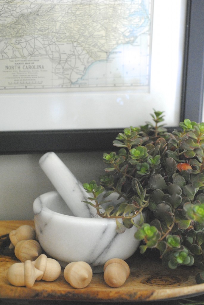
I bought this mortar and pestle on impulse from One Kings Lane {that’s an affiliate link to sign up where you’ll earn a $15 credit, by the way!}. It’s a little bit of luxury at a tiny price. The plant is another focal point, too– love succulents!
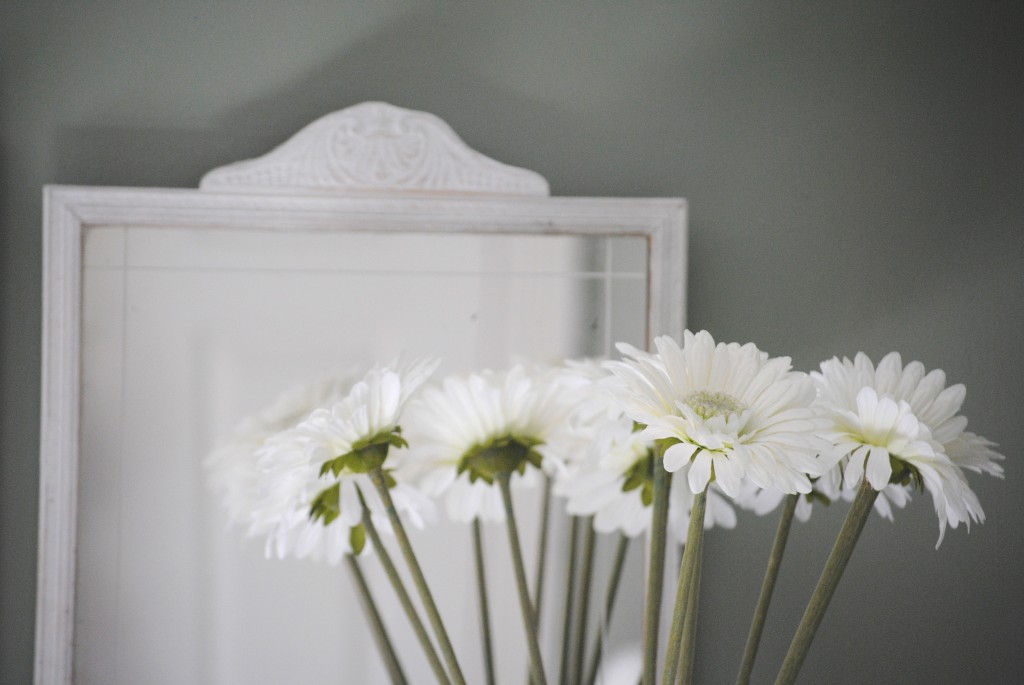
The flowers in this vase are SO simple. They aren’t totally my style anymore, but remind me of the time in my life before kids when I would shop at Pier One and dream of daisies.
Here’s how I used height in a fall vignette using an antique glass pedestal.
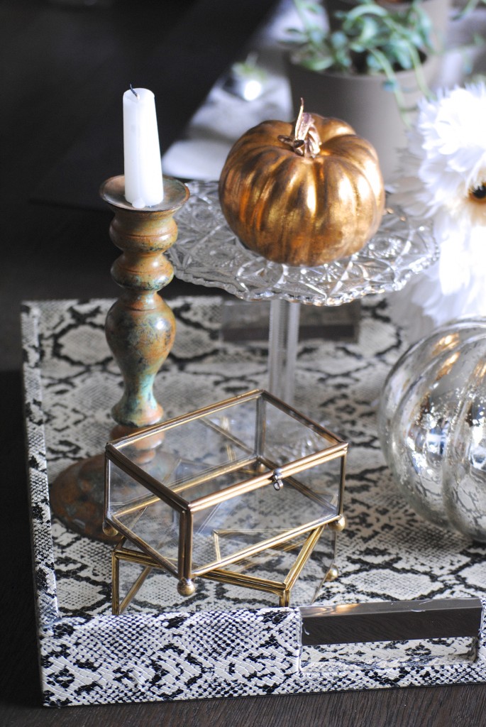
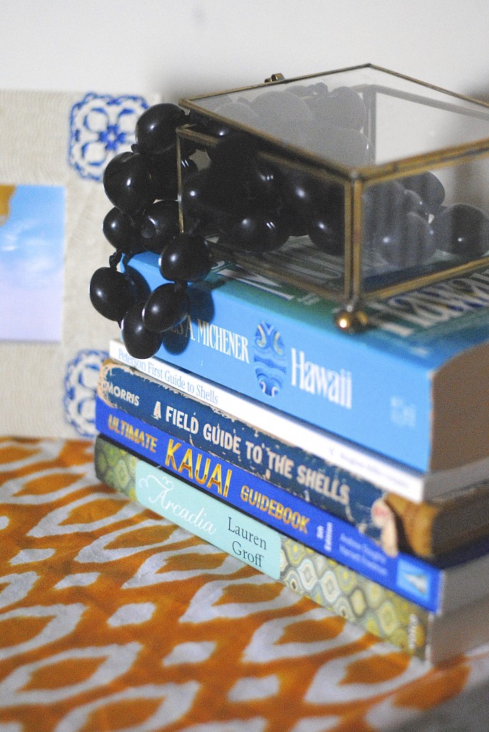
4. Layer on mementos or other objects that you love.
Now’s the time to add details. You can keep it simple such the vintage Christmas bulbs above because you love them, or as seen in session I was photographing for the King’s Hawaiian blog where I used my husband’s lei from our honeymoon:
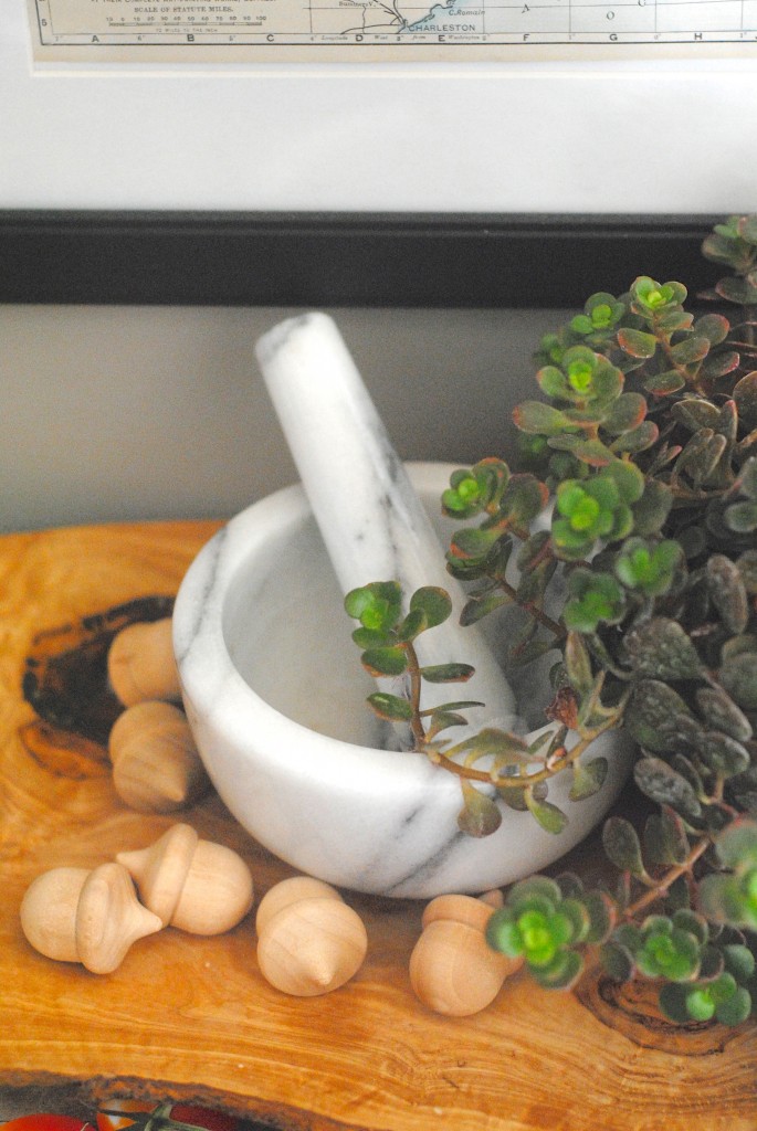
Wooden acorns add spunk to my kitchen counter vignette. Very simple, but you notice them, right?
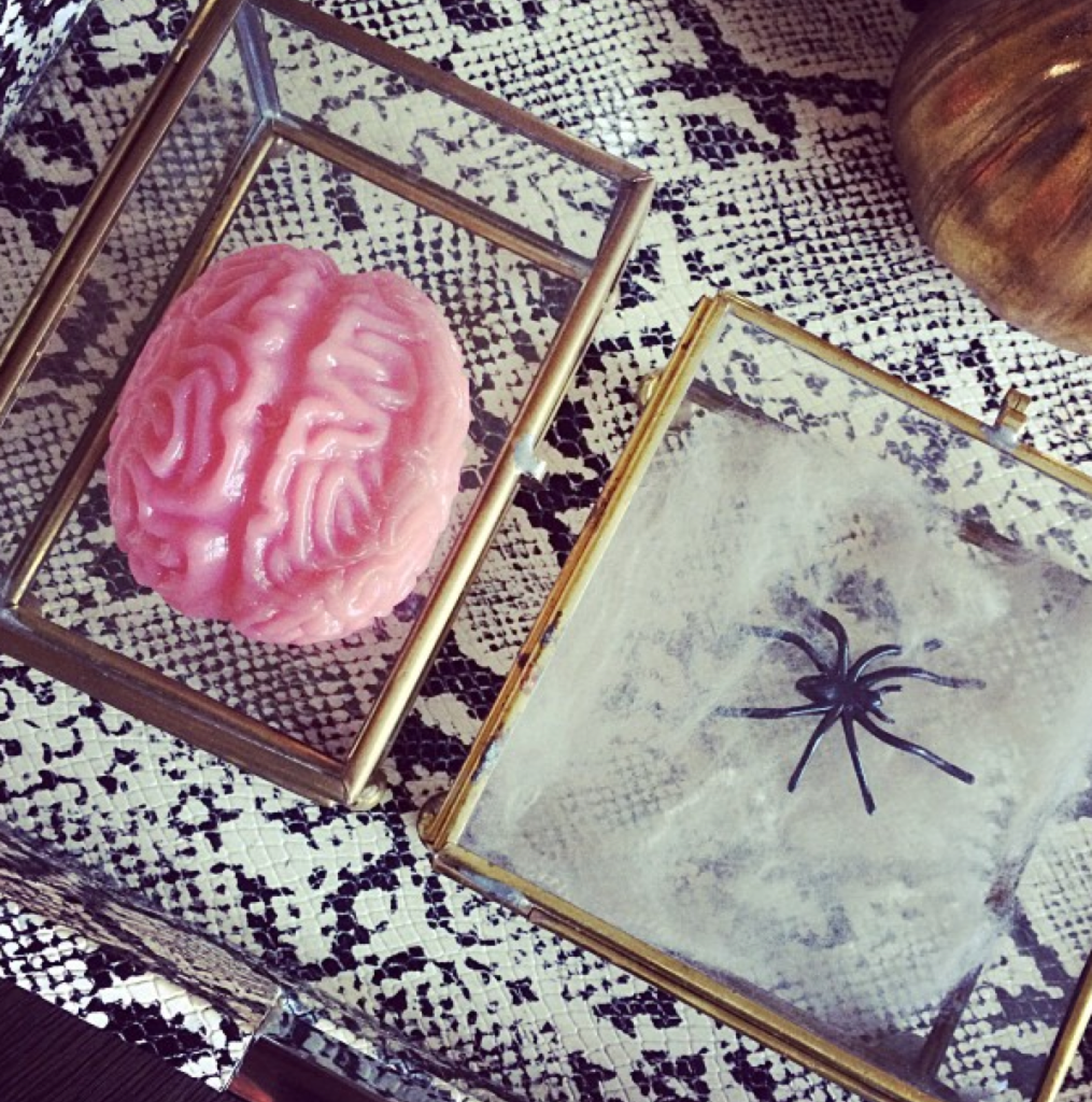
Mix it up with the seasons so it doesn’t gather dust, both physically and metaphorically. The brains and spiders added here say “I don’t take myself too seriously”. And they also say “Ewwwww”, because really, I hate zombies and spiders.
PS- do you know how hard it is to photograph mirrors without being in the picture?
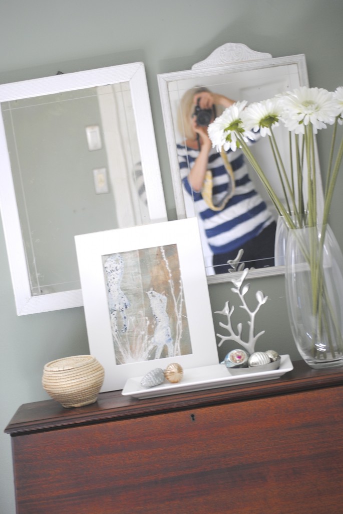
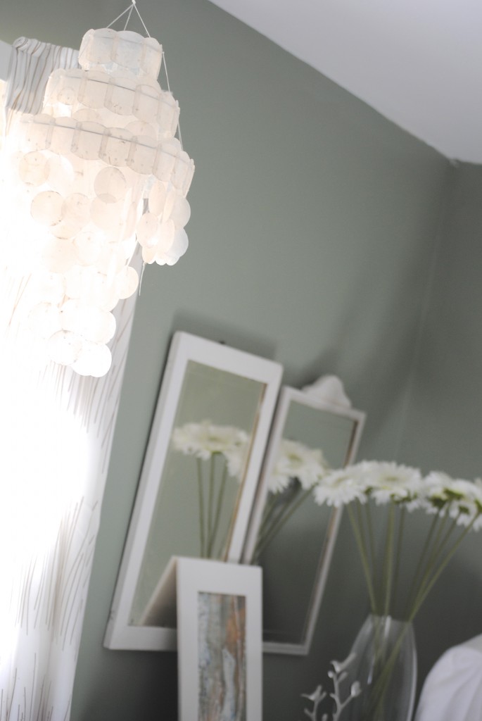
One last piece of advice to make sure your vignette is authentic to you. Be sure it fits the space. Our guest room is currently very soft, with a capiz shell pendant and soft lighting. That’s why this vignette works in there. It would be totally out of place in our bedroom or living room, though. However, the Hawaii honeymoon vignette is something that’s fun in our master bedroom but maybe weird in a guest room. See what I’m saying?
As you can see, I’ve recently discovered vignettes don’t have to be stagnant, old fashioned, or breakable. They can be family friendly and fun, and have a purpose of telling the story of your family. What do my vignettes say about me?
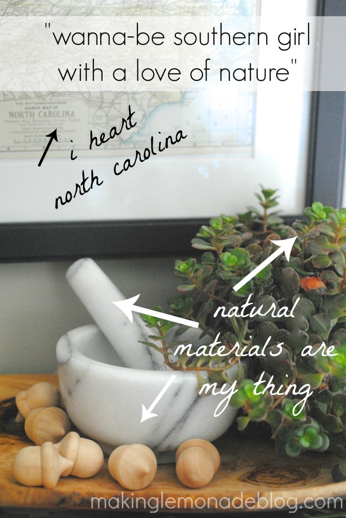
I should have added that I’m also kinda nutty to that one. 😉
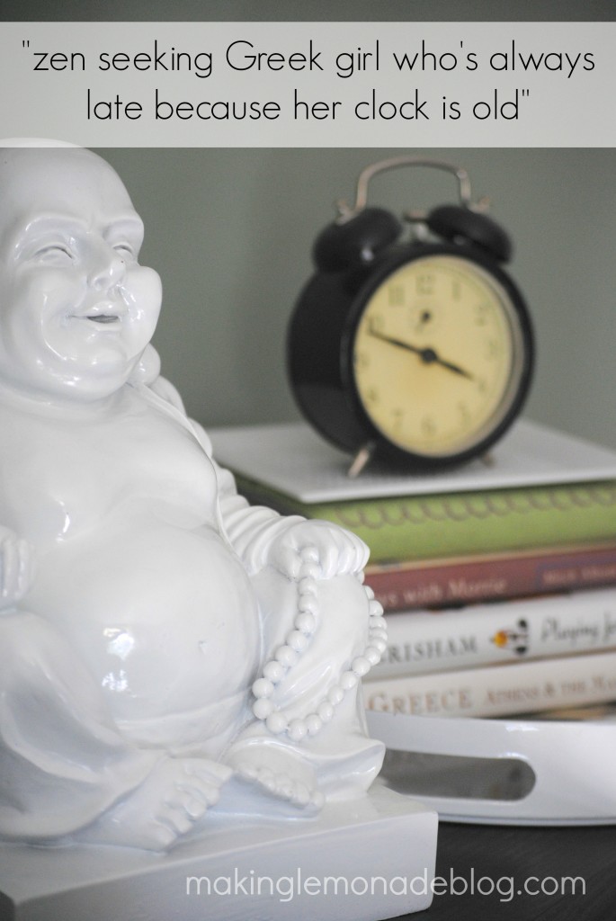
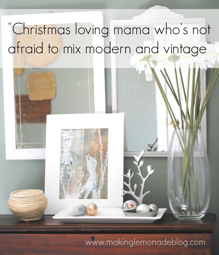
… but is, apparently, afraid to wash her mirrors. #ugh
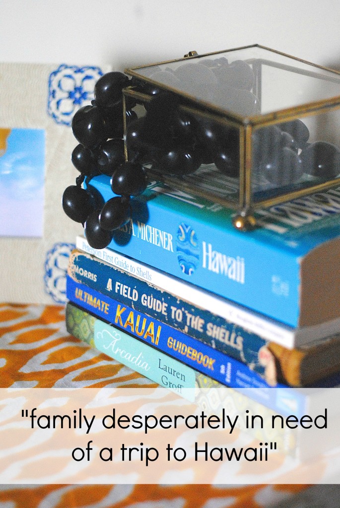
Do you have vignettes around your home? Where could you put one? What objects tell YOUR story? Share photos on the Making Lemonade Facebook page, and tell me what your vignettes say about YOU!
How to Style Vignettes (in Real Life) is Day 23 in the 31 Days of 15 Minute Decorating Ideas series. Subscribe in the header to get each quick decorating idea delivered to your inbox daily, and find of the rest of the 15 minute decorating ideas series here.
